Business Card Idea – Keep It Simple

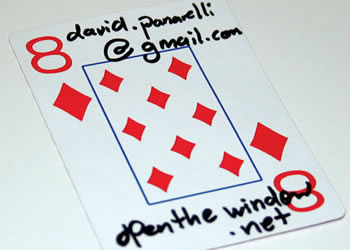
Every so often I come across a business card idea that I love. The above card is one of those.
Sure, this playing card business card is tacky. But it’s memorable. And for some professions, it just might do the trick. With the right person behind the card, I think it would be fun to receive.
How could you make this neater? Print on the playing card with your inkjet printer. Or find a place where you could just buy a bunch of Aces, and then print your message in the vast blank space.
I get so many business cards at meetings and networking events. Most of them suck. Many people just need some creative business card ideas to put some life into their cards.
I’m not going to rush out and buy a deck of cards and a sharpie. This isn’t the look I’m trying to portray with my law firm. My point here is that creativity can work.
Besides, in this impersonal world, a handwritten business card might actually be a welcome touch. It’s probably easier to get cheap or free cards from VistaPrint: 30% to 60% OFF All VistaPrint Products.
But it takes some time and attention to hand write your cards. You know how people like receiving and handwritten “thank you” note? The same might just apply to a business card. But be sure your handwriting is legible. 🙂
Writing this post just gave me another idea – autograph your business cards. That could be a cool way to give them a personal touch that our world lacks.
Here’s the point: simple works. And simple can be creative.
Photo by mringlein
Get more legal tips
|
See also... |
Comments
7 Responses to “Business Card Idea – Keep It Simple”


October 2nd, 2008
Simple is great as long as it is not too simple. The best way to go is order a business card design you like and instead of writing your information simply have “Name” “Email” “Contact”.
This way you can write different contact information (personal or professional) as hand them out to people depending on who is on the receiving end.
October 2nd, 2008
I kind-of like that idea. That could be a cool thing especially for people whose contact information changes frequently – like students.
October 3rd, 2008
you are way too into business cards…
October 3rd, 2008
@Mike – Haha. Perhaps I am. I’ll write about something different for my next post. I promise. 🙂
October 18th, 2008
Nice ideea. However if it makes a good impression or not, depends on both the personality of the giver and the receiver.
October 24th, 2008
This is hilarious! I might have to try this one. I would have to go with all Aces though. Not for the blank space as much as the fact that the receiver would rather get the Ace than the 8 of diamonds… IMO
October 30th, 2008
I agree that the playing card idea is memorable, though I’m not sure if I’d use it myself.
When it comes to business cards, I always opt for the simple design. I used to be caught up with flashy business cards and thought that they added value to my company. The reality is that they were so busy that people just gave them a quick glance and didn’t even bother to read them. I can relate because I do the same thing.
These days, I have a simple logo and a few lines of text and that’s it. No photos, funky text, or wild colors. Sometimes, simple is better and this is an example of that.
Steve